
Build Better Mobile Apps Using Digital Minimalism

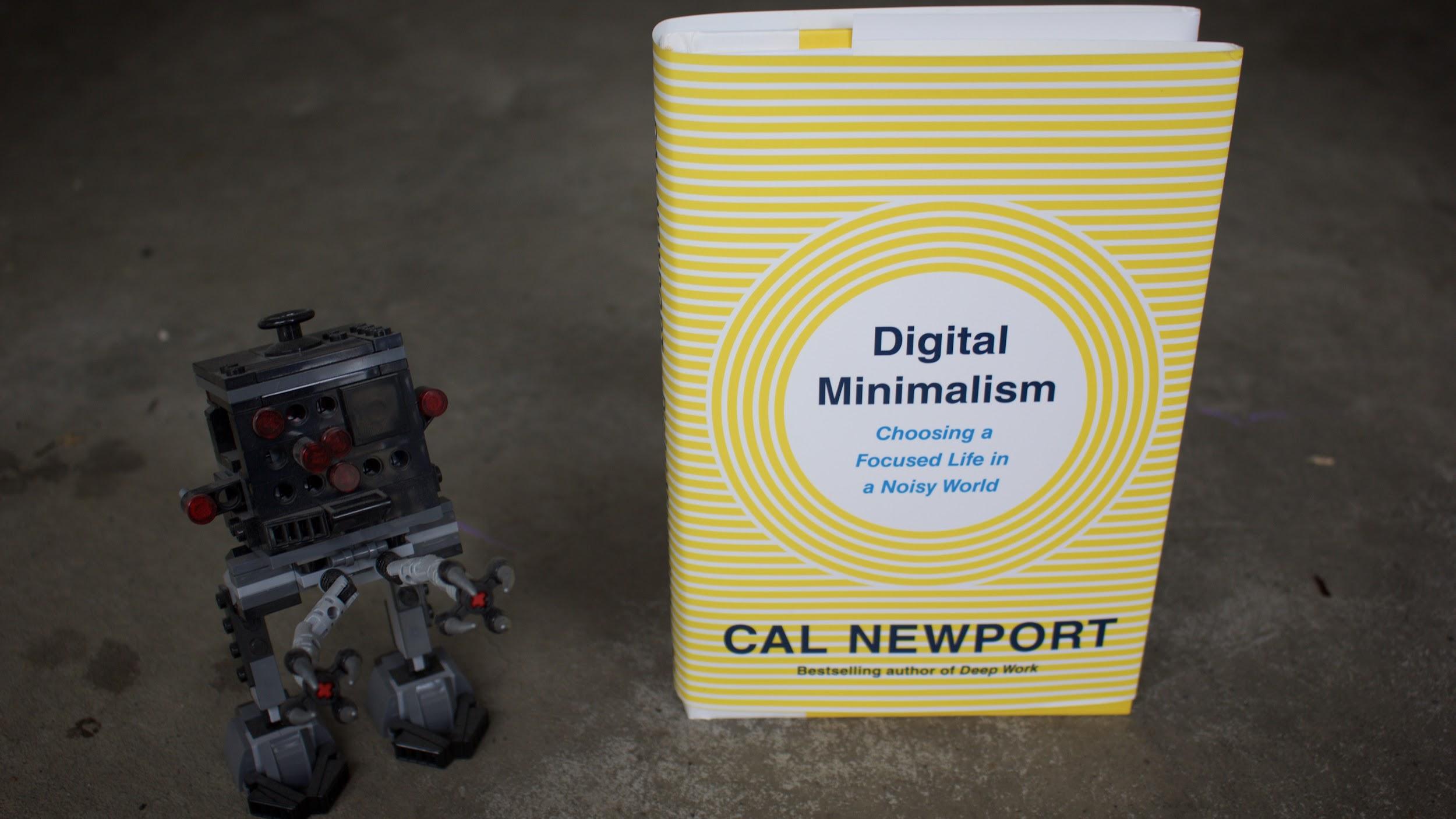
Recently Cal Newport released Digital Minimalism which focuses on building a productive life in the midst of all of the distractions that our devices can throw at us. For some app developers this call to a world where we purposely don’t allow our devices to become a center of our lives is a worrying thing. Many developers started their apps with the idea that more time spent by users is the only metric that matters.
Here is where Newport would differ from many to say that the metric worth measuring is how much utility an app has in the life of the user. Are they getting real measurable value out of the time spent with the app, or does your app only provide some general feeling of being connected?
Let’s start by looking at what the basic ideas of digital minimalism are so that we can understand them. Then we’ll explore what it means to build apps that have high utility for our users.
The Basics of Digital Minimalism
“Digital Minimalists see new technologies as tools to be used to support things they deeply value — not as sources of value themselves. They don’t accept the idea that offering some small benefit is justification for allowing an attention-gobbling service into their lives, and are instead interested in applying new technology in highly selective ways that yield big wins.
Cal Newport in Digital Minimalism
One of the most interesting things that Newport says in his book is that if the people who build Facebook used Facebook like they try to get users to use Facebook, they’d never have the time to build Facebook. On that note, Newport asks users to give themselves a 30 day detox from their devices.
This detox is the removing of any device/screen that isn’t crucial to their work. For my wife that would mean she can use Facebook Messenger with her boss because it’s the only application that’s allowed through the corporate firewall where the president of the board for the skating club works full time. It would also mean that she would have to ignore all other Facebook Messenger notifications because they’re not work related.

Once you’ve taken a 30-day break from all device time that isn’t required for work you’re ready to reform the relationships with new rules. The second part of Digital Minimalism is where Newport reveals a number of practices to help you get the most utility out of your time with devices.
Newport recommends that you never click like, because it’s low bandwidth communication that makes you feel connected without actually creating any meaningful interaction in a relationship. Instead call that friend that had a cool picture and talk to them, or go out for coffee. Visit their new baby instead of taking the easy way out and clicking like on a photo.
Another key practice is to use social media, and all apps on your devices, like a professional would use them. If you’re a professional getting paid to manage someone’s social media account you go into your client’s social media accounts with a purpose. You accomplish your purpose and then you move onto your next task.
As more and more people start to be strict about their use of devices that means we have a higher bar to jump to provide a useful experience to our users. It means we have to ensure that we don’t annoy them with our apps.
How to Build Apps That Have High Utility
Let’s look at some of the ways we can provide our users with a high utility experience with how we build our apps. Let’s specifically look at these three areas.
- Changing Your Success Metric
- Using Notifications Wisely
- Exposing the Best Features of Your App
Change Your Success Metric
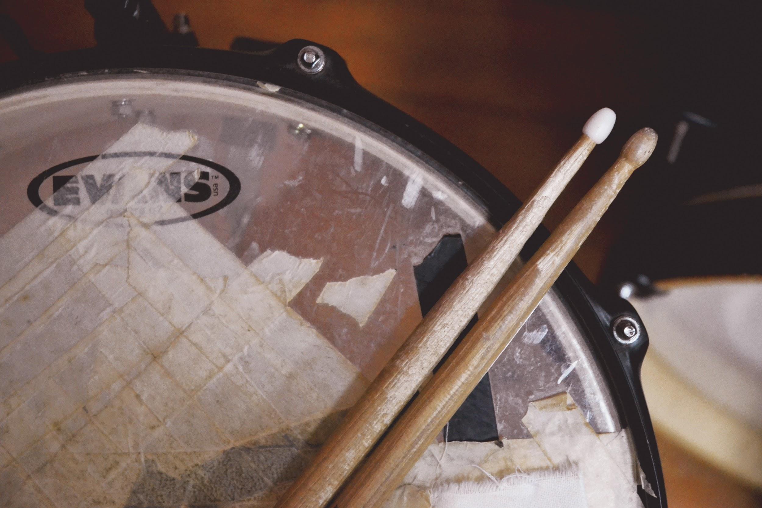
The first step in building a high utility app for our users is to not default to simple attention or time on screen as your sole criteria for success of your app. If you’re providing online drumming courses, having users watch a bunch of content without doing the drum exercises you’re recommending means they won’t see progress in their musical skills. If they don’t see progress, they won’t continue to be customers. If you put the extra effort into measuring the completion of the course or drumming skill improvement you’re going to align your metrics with ones that are positive to your users.
Yes if you’re going to measure skill improvement you’re going to have to have a way to evaluate the skill. That may mean a bit more time investment on your part as you take the time to get on a call with your users and check in on their skills but this is crucial for business development. We do it here at AppPresser as we reach out to random new clients to see what their onboarding experience has been like so we can improve it.
If you’re running a church app, don’t focus on the easy metric of how many people donate online, look at how many people stream or download the weekly service. Look at how your congregants use your app to connect and then help each other day to day. Show your congregation the utility of the app by bringing users up to the front during your service to show how the usage of your app has impacted their lives in a positive way.
Notifications Can Kill Your App
One of the features I hate about the modern web is the ability for sites to try and send me notifications. Not once on any site that’s asked have I ever wanted notifications when a new article is published. Even when I regularly read the site, and listen to any podcasts it puts out and watch the site’s YouTube Channel all the notification ask does is annoy me. In fact I’m less likely to visit the site to read article. I’ll send the article to a-read-it later service like Instapaper to avoid the assault on my eyes.
Your app can get lumped into the same boat if you’re not careful about the notifications you send to users. If your users believe as Cal Newport does that any notification is a thief to your focus, you better make sure that any notification you send to a user is one they can’t live without.
With AppPresser we allow you to segment notifications. By using this feature you can allow users to customize their notifications. If you have lots of notification possibilities then make sure you use your introduction slides to talk about notifications and link them to the notification page so they can customize their notification settings. You could even take it a step further and email users when they first use your app and make sure that you link to the notification customization page of your app.
Which features do your users value most?
Hopefully you’re doing this next one already, but make sure you understand what feature of your site users most value. If you’re building online courses, make it easy to find the next lesson that your users need to complete. If it’s a social network with AppCommunity, make sure that you expose the most used community feature as soon as your users open the app.
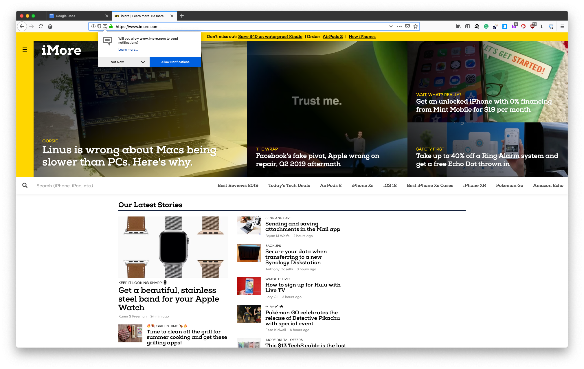
We can see a poor example of an app respecting it’s users if we look at Apple News+. I’m already a subscriber to this service and yet if I scroll down the headlines for Apple News+ I still get an ad asking me to sign up for a service I’m already signed up for inside the app. You can see this in action in the screenshot below.
The worst part about this is that one of the sales promises Apple makes is that their devices and ecosystem just work together and I don’t need to worry about anything. Every single time a user sees this ad for a service they’re already subscribed to Apple is decreasing the utility of Apple News+. The biggest selling feature of Apple News+ is getting news without all those extra ads, so Apple tossing in an ad for a service users are paying for is nothing short of terrible.
Before you start building your app, make sure you know what your users do most on your site and then expose it so that users never have to think about where to find that feature.
Does this seem like extra work?
If building your app for maximum utility seems like more work than just aiming for time on screen, you’re right it is. Measuring user outcomes is harder than simply looking at basic revenue numbers. Of course you do need to monitor your app revenue, but if you can build high utility apps, you’ll see revenue follow.
When your users reach for your app because it brings so much value to their life that they can’t live without it, you’re building a solid foundation to build an amazing business.
Let’s leave you with this funny viral video, but watch till the end because that’s the key. Building apps that enhance the world around us so that we can interact with it.
Thanks for sharing this post, simple is always better almost on everything. Especially we talk about creating an app, it’s certainly better for users and also usually there are fewer bugs when an apple has a simple interface
Apps and games are the fundamental need of every Android user and if any source is available to customize the apps then its ice on the cake.