
Let’s Make WooCommerce Checkout Better
Most forms suck on mobile, especially checkout forms.
No one likes to type on mobile, and filling out a form requires a lot of typing. The average checkout form has 10-15 required fields to fill out. First name, last name, phone number, address 1, city, state, country, zip, plus multiple credit card fields. Many forms have even more than that.
Mobile keyboards are small and inconvenient, and moving from field to field to continue typing is a pain. Take a look at the mobile checkout form on the right of this page. It uses responsive design, but it still leaves us with a monstrous, conversion-killing beast.
Oh sure, it uses responsive design, so the form fields get bigger. Big form fields suck a little bit less than small ones, but it doesn’t really solve the main problem.
Looking at that form on mobile gives me anxiety, and it’s certainly not helping your sales. If you are like me, you have probably browsed for a product on mobile, and then switched to desktop to make your purchase because you knew it would be easier.
It’s no wonder mobile conversion rates are one-third of desktop conversion rates or worse, in almost all sectors.
It doesn’t matter which category your business is in, it’s highly likely that your mobile conversion rates are still below 1%, even with a smartphone-optimized site. — Mobify
Mobile accounts for over 50% of ecommerce traffic, so why has the mobile checkout form been ignored for so long? Ecommerce sites are losing revenue due to poor mobile conversion rates. It’s time we optimized checkout for mobile.
So how do we do it?
You may think low mobile conversion rates are because of native device limitations, like a small screen and keyboard. That is certainly part of it, as well as people (like me) that switch devices to purchase. The fact is people WILL buy stuff on mobile if we make it easy for them. How do we make it easy?
We make checkout faster and easier with mobile specific UI and UX improvements.
There’s been a lot of research done on mobile checkout that we can draw on to make our improvements.
Since we are big on WordPress here at AppPresser, and WooCommerce is the #1 online Ecommerce software, we’ll pick on Woo as an example. However, these issues are universal, and certainly not limited to WooCommerce.
Let’s take a look at a few ways to make our mobile checkout forms better.
Lower perceived difficulty with multiple pages
Luke Wroblewski (Product director at Google) talks a lot about how perceived difficulty can kill our mobile form conversion rates. Seeing 15 required fields in a long single page layout can make users mentally give up before they even start. Even if we can’t remove fields, we can lower the perceived difficulty with better design.
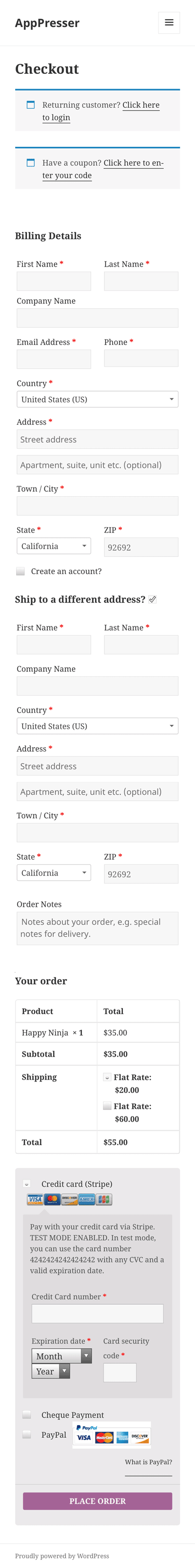
Crazy Egg recommends to divide our form into bite size chunks. With WooCommerce, we can divide the customer details, address information, and payment information into 3 pages.
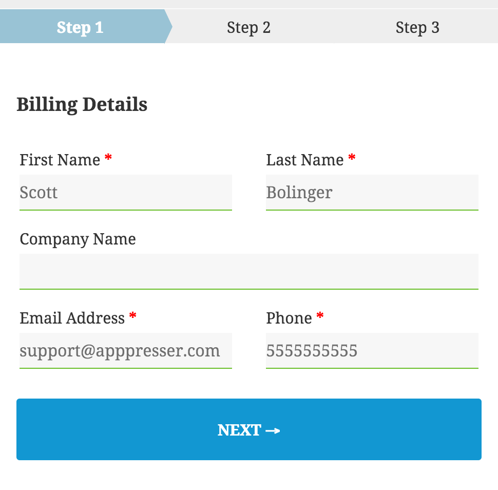
A multi-page form is easier to deal with psychologically, even if it has the same overall number of fields. It allows most fields to be visible even in the small frame of a phone, and lets people focus on one thing at a time. This allows your checkout form to feel much easier to fill out, which improves conversions.
Using multiple pages requires some additional considerations. Adding a progress bar can help users keep track of where they are in the checkout process, and see when it ends. It gives them a “light at the end of the tunnel” while filling out your form. Make sure users can easily navigate back and forward between checkout steps in case they need to make a change.
Tip: speed is super important on mobile. Using Javascript to navigate between pages is much better than page refreshes.
Get the Ultimate WooCommerce Checkout Customization Guide
We compiled everything we could find about customizing WooCommerce Checkout. Enter your info below and we’ll send your guide right away.
Design inputs for touch, not a mouse
Touch inputs are very different on mobile. They need to be larger, and designed for an imprecise thumb, instead of a mouse.
Take a radio button for example. On desktop, it is small, and requires a very precise mouse click to select. On mobile, the radio button should be much taller and wider, and allow clicking on the entire label, not just the small input itself.
Luke Wroblewski also recommends that drop down inputs should be avoided.
Interacting with dropdown menus on mobile and the desktop is a multi-step process often requiring more effort than necessary. First tap the control, then scroll (usually more than once), find & select your target, and finally move on. We can do better.
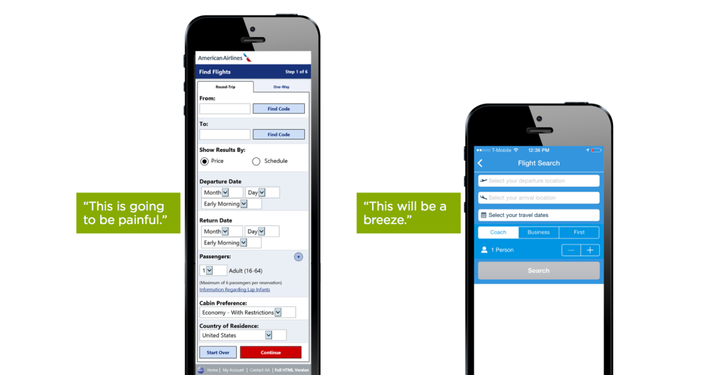
Photo: LukeW
Buttons should be used instead of text links, they tend to be larger and easier to click. In the photo above, you can see the “Information regarding lap infants” text link, which looks impossible to click. Making buttons and other touch inputs full width and at least 44px high allows for easy touch interactions.
Tip: Text inputs can be jumpy when using fixed positioning, so avoid it. Many mobile browsers zoom on inputs, which is not always desirable. Set input text size to 16px to avoid zooming.
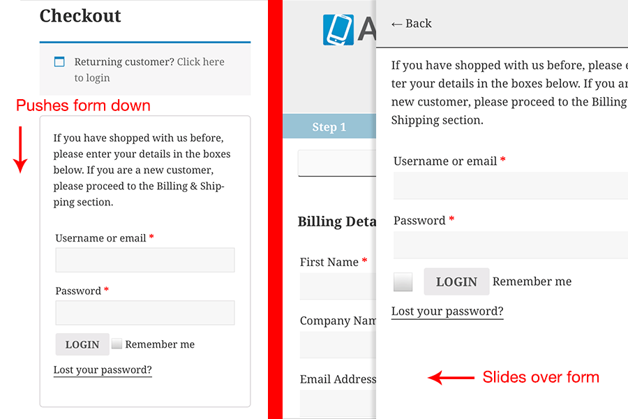
Better UX with offscreen inputs
What if we use the small screen as an asset instead of a liability? We can do this by moving some of our inputs off screen, and calling them only when we need them. This saves precious screen real estate, and removes distractions.
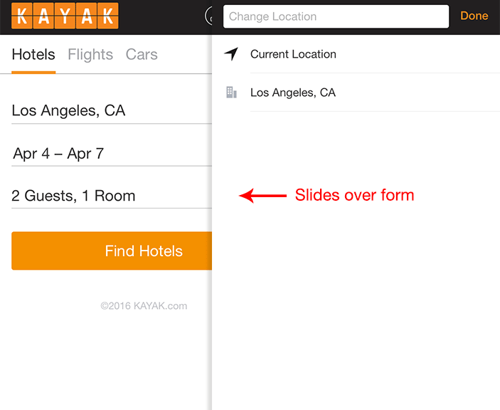
Kayak.com uses off screen modals for almost every input. This allows them to keep the aesthetics of the form very simple, and use all of the screen real estate when interaction is required. Go to their site and try it out, it’s a beautifully designed experience. I can only imagine how much this improves their conversion rate over a long single page form.
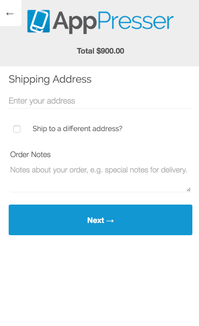
If we apply this principle to our checkout form, we can move some of the extraneous features off screen. For example, the login form is really tall. When we click to login, this form expands to fill the whole screen, and pushes down our checkout form. If we move this off screen, we don’t have to make our checkout form appear longer.
On the left you can see the default behavior, on the right is our modal.
We can do the same for other elements, such as a coupon code or order review. By moving these items off screen, we allow an uninterrupted flow for checkout, as well as making our form appear shorter.
Input attributes

Mobile keyboards can show different things based on the type of input. For example, a text input will show the normal keyboard, an email input will show a handy @ symbol, and a “tel” input will show the number pad.
Using the proper input attributes can be a huge timesaver when filling out forms. WooCommerce misses some opportunities for better input attributes.
For example, the ZIP and Credit Card number fields show a normal text keyboard, when it should show numbers. We can correct this by adding a “number” or “tel” input type to these fields. Personally I think “tel” works better, because it just shows a big number pad.
There are also autocomplete attributes for each type of field, such as autocomplete=“email”, autocomplete=“cc-number”, or even autocomplete=“off”.
We can do this a couple of different ways, either swap out the default fields with PHP, or use Javascript. Here’s some sample Javascript for some of the Woo fields:
$(document).ready( function() {
	$('billing_postcode').attr('type', 'tel').attr('autocomplete','postal-code');
	$('input.card-number').attr('placeholder', '•••• •••• •••• ••••').attr('autocomplete','cc-number').attr('type', 'tel');
	$('.card-cvc').attr('placeholder', '•••').attr('autocomplete','cc-csc').attr('type', 'tel');
});
Address Autofill
Autofill completes your forms with information you’ve used before, such as email and address. I love autofill when I’m on the desktop, it saves me a lot of time. Autofill is a little different on mobile, because it’s turned off by default on iPhones for security reasons.
Chrome for Android allows autofill, but we should assume autofill will not be present. Since we don’t know our customer’s information, the best place to make up ground is with the address field.
Complex address fields have been shown to confuse users, and the address alone accounts for at least 5 of our checkout fields. Add 7 more fields if there are separate shipping and billing addresses, that makes 12 required fields.
What if we could turn 5 address fields into a single input? That would bring our 12 input fields down to 4, a massive improvement. We can do this by using a single address field to autofill the rest.
Google has a handy script that uses their Places API to search local addresses as you type, and it can autofill multiple address fields when it’s clicked. This one change makes filling out an address trivial, and can be a huge conversion booster.
Conclusion
The most important thing to do to increase mobile conversions is to help your customer checkout faster and easier.
Mobile forms need a lot of work to make this happen, but the good news is that it’s possible. Responsive design is a start, but it won’t get you the best results. Going beyond responsive by designing specifically for touch and small screens is the only way to do it.
Test the changes above on your mobile checkout screen using A/B testing software and tweak to get the best results for your business.
=> Share this article on Twitter
Get the Ultimate WooCommerce Checkout Customization Guide
We compiled everything we could find about customizing WooCommerce Checkout. Enter your info below and we’ll send your guide right away.
6 Comments
Is there a plugin you recommend for dividing checkout pages for Woocommerce (web)?
We might have something for you, sign up in that opt-in box above and you’ll get more info 🙂
Cool thanks! I signed up. So far all I found was a 3rd party app on codecanyon.
What do you know https://github.com/woothemes/woocommerce/issues/10672 “Revise Checkout Flow” just got kicked off.
Saw that, glad they are working on some improvements.
Hi Guys
I am looking for an option to autofill the postcode by giving the city of a country
I am from Venezuela and anyone use postalcode
I need something like
Country – – State – City = Postalcode