
How a Self-Audit Improved Our Product Usability
Many product developers, ourselves included, focus more on the code than UI/UX.
It can be helpful to take a step back and look specifically at usability with a self-imposed audit. After all, perfect code doesn’t matter if your product is hard to use, amirite?
For this audit we’ll be using the Nielsen Norman Group’s 10 Usability Heuristics for User Interface Design. Even though they are decades old, they are no less useful than they were in 1994.
I’ve narrowed it down to 7 of the most important heuristics, talk about its implications, and apply it to our products in the form of an audit.
I did most of this on my own products, so I’ll share what I found and improved, and hopefully you can do the same.
Let’s get after it.
Visibility of system status
The system should always keep users informed about what is going on, through appropriate feedback within reasonable time.
People have to know what is going on in the background, otherwise they feel confused or frustrated. It seems obvious, but the devil is in the details.
Examples: upload progress bar, a confirmation message like “your message has been sent”, or a loading spinner.
Action => System Status Indicator => Resolution
When a user adds an image to an upload field and submits, we show them a progress bar. On success or error, we give them a message what happened.
Counter examples: uploading an image and not seeing any progress bar or loading indicator. The user would think an error happened.
Auditing our product
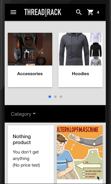
We’ve had various bugs with people trying to login and not seeing appropriate error messages that needed better error handling. One interesting problem we had was loading WooCommerce products inside an app. We showed a loading spinner, but that’s super boring. We decided to use skeleton graphics instead, which looks much nicer.
User control and freedom
Users often choose system functions by mistake and will need a clearly marked “emergency exit” to leave the unwanted state without having to go through an extended dialogue. Support undo and redo.
Example: showing a prompt for “are you sure” when deleting something, undo in Google Docs, CMD Z to undo typing, back button in a browser or app, trash bin in WordPress.
Counter example: not showing a prompt for a “delete” button. Users will accidentally delete.
Auditing our product
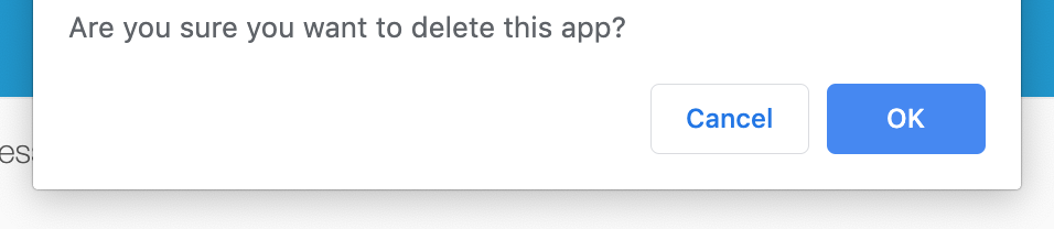
We had a “Delete App” button that would delete the whole app. It had no confirmation message, it just wiped out all customer data, with no trash or backup. What could possibly go wrong?
Go wrong it did.
The obvious fix for this was to add a confirmation message, then send the app to a “trash” state instead of wiping it out entirely.
Consistency and standards
Users should not have to wonder whether different words, situations, or actions mean the same thing. Follow platform conventions.
Example: using WordPress buttons and meta box design for a plugin settings page.
Counter example: using unclear icons. Do you know what these do?
Auditing our product
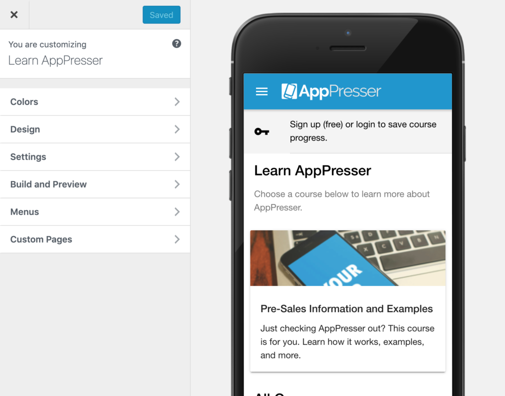
We use the WordPress theme customizer for our app builder. This interface is familiar to our customers, since they have probably used it on their own website.
This means that they have less new interfaces to learn when using our product.
Error prevention
Even better than good error messages is a careful design which prevents a problem from occurring in the first place. Either eliminate error-prone conditions or check for them and present users with a confirmation option before they commit to the action.
The key here is preventing errors before they occur. This would fall under “design that you don’t see.”
Example: don’t put a delete button right next to an action button. Don’t let someone upload an image if it is too small.
Counter example: Filling out a form and submitting, and there is a nondescript error. Only by changing each field and re-trying do you find out it’s a ‘user already exists’ issue on the back end. (This happened to me with Apple sandbox testing)
Auditing our product
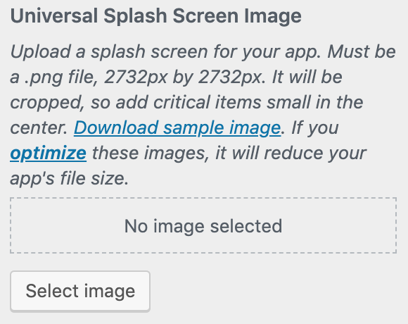
We have an image uploader in AppPresser for app splash screens. Even though we explicitly state the size of the image, and even allow them to download a sample, some people inevitably upload the wrong size.
To fix the issue, we changed the uploader to explicitly crop the image to 2732×2732 no matter what size was uploaded. (If you are interested in the code, we changed WP_Customize_Media_Control to WP_Customize_Cropped_Image_Control and set the height and width)
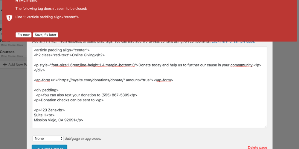
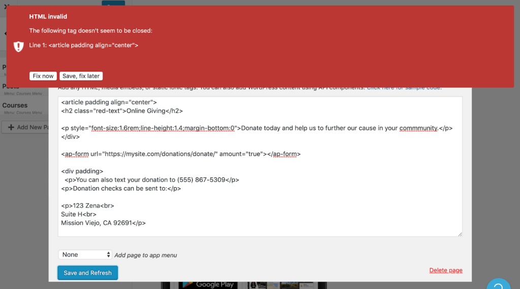
Another example is our HTML editor. We had a problem with people adding invalid HTML, but they wouldn’t know until they saved it, rebuilt their app, and loaded up the preview and got a weird error.
We fixed this by adding an HTML validator when the user is creating their page.
Aesthetic and minimalist design
Dialogues should not contain information which is irrelevant or rarely needed. Every extra unit of information in a dialogue competes with the relevant units of information and diminishes their relative visibility.
Example: shorten error messages to have human readable text and maybe an error code for a developer to look up. We did this with AWS messages that were way too long and convoluted.
Counter example: our AWS error messages used to print out the whole API error response, which looked like a foreign language to our users.
I think we can extrapolate this heuristic about dialogues to all product features. I forget who said it but I like this quote:
“Every feature you add makes your product worse for those who don’t use it.”
Being clear and minimalist applies to all product features, not just dialogues.
Auditing our product
We get feature requests almost every day.
It’s easy to fall victim to the “sure I’ll add that feature, it will be easy!” trap. We’ve all been there, especially in the early days.
What you find out down the road is that only a few people are using that feature, and it’s causing bugs and support issues. It consumes your time, but is mostly a distraction from what is most important.
These days when we consider adding a new feature, we ask, “will over 50% of our customers use it?” If not, we can still choose to add it, but most of the time we won’t.
Help users recognize, diagnose, and recover from errors
Error messages should be expressed in plain language (no codes), precisely indicate the problem, and constructively suggest a solution.
We all know to print out error messages on the screen, but we can take it a step further.
Give your users information on how to fix that type of error, with a link to documentation or support.
Counter example: login failed, please try again. (trying again usually produces the same error)
Auditing my product
We use AWS for our push notification system, and their API sends back crazy errors like this:
Error creating policy Error executing \”PutUserPolicy\” on \”https://iam.amazonaws.com\”; AWS HTTP error: Client error: `POST https://iam.amazonaws.com` resulted in a `409 Conflict` response:\n\n \n Sender\n LimitExcee (truncated…)\n LimitExceeded (client): Maximum policy size of 2048 bytes exceeded for user asdf – \n \n Sender\n LimitExceeded\n Maximum policy size of 2048 bytes exceeded for user asdf\n \n 7670af1b-12a9-11e9-93ee-eb368996dbfb\n\n
Since our customers can’t decipher that craziness, we would get a lot of emails about push notification setup errors. To fix this, we parsed these errors into a human readable format with a possible resolution. Support techs can still see the full error, but customers just see the readable text.
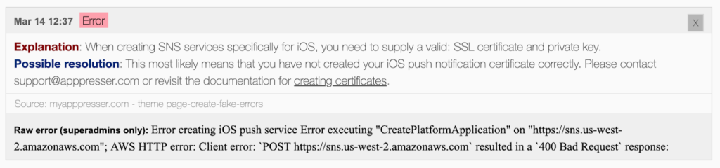
The customer gets a plain text description of the problem with a possible solution, and a link to related documentation.
Conclusion
Since products are always evolving, our job reviewing usability is never done.
The good news is that if you keep these heuristics in mind, you can build with usability in mind instead of fixing it after the fact.
This was just a quick audit, hopefully you found some low-hanging fruit. The next step would be a deeper review to find hidden or edge case issues. (I know you won’t do that though, because you have like 50 support tickets waiting in your queue as you read this.) That’s ok, you can fix stuff as you find it later on.