
Is your WordPress website “mobile friendly” to Google?

You may have heard of #mobilegeddon recently, which is the common name for Google’s algorithm change.
The change makes mobile friendliness a ranking signal, which basically puts good mobile sites higher in the search results. Conversely, this penalizes websites that are not mobile friendly.
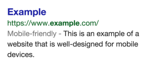
Late last year, Google also announced that they would add a “Mobile Friendly” tag to search results, as pictured.
The #mobilegeddon update began rolling out last week (April 21st), and so far it has not been as catastrophic as expected. It’s too early to tell for sure, but it seems Google is giving everyone time to get mobile ready before doling out big penalties.
One thing is certain, making sure your website is mobile friendly has never been more important. To make sure your SEO is not negatively affected, you’ll want to check a few things on your site. Let’s look at what Google recommends you check on your WordPress site.
Google offers advice to WordPress site owners on how to make sure you don’t get penalized by their mobile friendly update. Here are the main points, and what you can do to check your site.
Update WordPress, and your theme
It’s always a good idea to keep everything up to date, especially due to recent security patches to WordPress core.
Updating your theme will ensure that any mobile updates by your theme author are included on your site before you do any testing. Many times theme authors will release fixes and updates, this is especially important if you haven’t updated in a while.
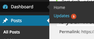
To update, login to your WordPress admin and visit Dashboard->Updates. Update WordPress core, your theme, and any plugins.
Make sure to back up your database and files before doing any major updates.
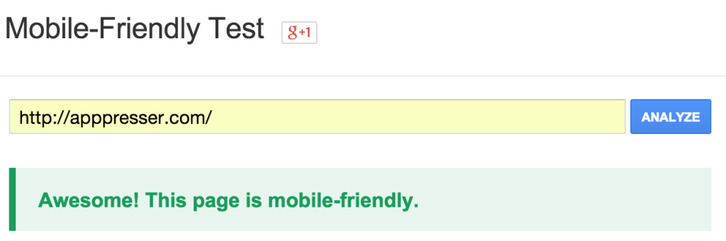
Use the mobile friendly test tool
Enter your website url in Google’s mobile-friendly test tool: https://www.google.com/webmasters/tools/mobile-friendly/
Hopefully you see a green message like this:
If not, you’ll want to review the errors and see if you can fix them by customizing your current theme. If that seems overwhelming, you may want to consider switching themes and running the test again.
Even if you get the green light from the test, you shouldn’t stop there. Let’s look at some common mobile SEO mistakes, and how you can avoid them.
Common Mobile SEO Mistakes
Google offers a guide to common mistakes for all mobile websites, let’s look at how that applies to your WordPress site.
Slow mobile load times

Load time is incredibly important on mobile, since internet connections are inconsistent when you are on the go. Bounce rates tend to be 10-20 percent higher on mobile, so making people wait will make that even worse.
In 2013, Matt Cutts announced that Google would begin to penalize sites for slow mobile load times. How do you speed up WordPress?
How to Speed Up WordPress for Mobile: The Ultimate Guide

Download a comprehensive PDF guide, including 7 ways to speed up your site, how to test current speed, quotes from industry professionals, and lots more.
1. Deactivate plugins you aren’t using
If you aren’t using a plugin, get rid of it. Some plugins load scripts, styles, and other assets even if they aren’t being used on the page. This slows down load times, and it’s an easy fix.
2. Conditionally load plugin assets
This is more technical, but you can actually get rid of scripts and styles that aren’t needed on certain pages. Sometimes a contact form plugin will load their assets on every page, even if there is no contact form on that page. You can save some page weight by telling that plugin to only load their assets on the page with the form.
To learn more, check out this article.
3. Optimize Images
Over 60% of the average web page size is images. That means it’s the lowest hanging fruit for you to begin optimizing.
When you upload an image to WordPress, it automatically crops and optimizes it, so you can put a smaller image in your page or post. This is a great start, here’s a few more tips.
- Don’t use carousels or sliders with lots of images on mobile pages
- Always use as few images as possible
- Use small, low resolution images, and link them to higher resolution versions
- Examine source code of slow loading pages, sometimes themes/plugins use big images where they shouldn’t
You can also use responsive/adaptive image solutions like Picturefill. This allows you to serve different size images based on the screen size. So a desktop computer can get a large, high resolution image, while a phone can get a small, optimized image.
The implementation can get pretty technical, there are also plugins to simplify the process.
4. Use a good web host
If you are on $5/month shared hosting, your site will be slow no matter what you do. Simply moving to a better host can give your site a huge boost in speed.
Unplayable Content

Some media players don’t work on mobile, especially on older sites. Flash doesn’t work on iOS devices, so if you are using an old media player you’ll want to update it. This isn’t as much of an issue as it used to be, but it’s good to check.
You’ll also want to make sure your videos look good with your theme on mobile. Sometimes video widths can be an issue, since not all players are responsive. You can make your video player responsive using FitVids, here’s a guide for that.
Broken links
It’s always good to make sure you don’t have any broken links or 404s. There are online tools and WordPress plugins that will help you check for broken links.
Conclusion
It’s important to make sure your website passes Google’s mobile friendly test, but there is a lot more that needs to be done to optimize your site for mobile.
The average site gets around 30% of its traffic from mobile, that’s too large a percentage to ignore. Mobile users have shorter attention spans and slower internet connections, so speed is incredibly important.
For more WordPress speed optimization tips, check out this in depth guide we wrote.
What part of mobile friendliness is most important to you? Leave a comment below.
Cheers!
1 Comment
Awesome article. Another important thing to do is to make website AMP ready. Google is pushing use of AMP by giving a slight rank boost