How to Masterfully Navigate the Web

I spent the better part of my early years in the San Francisco Bay Area, both working and playing in The City. So I’m no stranger to the wood-paneled lobbies, translucent atriums, and endless maze of cubicles that define the inner spaces for many of San Francisco’s towering structures, that mass of shapes defining the silhouette for one iconic skyline.

I was employed, for the most part, in the field of architecture during my time downtown. A blessing of sorts, that may have helped as I worked my way through the concrete jungle.
On many occasions, I was visiting a particular location for the first time. Now keep in mind this was in the pre-GPS timeline of early man. (Raise your hand if Thomas Bros. means something to you.) And because some of these errands came with time restrictions and constraints, I had to quickly learn a few common sense ‘tricks’ to help expedite my objectives efficiently.
The first, is that most buildings have a main entrance.
This was important and key to the rest of my mission because finding the main entrance also meant that I would find in one place, all the resources needed to complete my task. This brings me to a second lesson I learned.
That is, within the main entrance of most buildings there will be a directory or map of that building.
When walking into these large commercial spaces, like a mall, medical facility, or office tower – especially for the first time, not only did I expect to find a directory there, but also a helpdesk or kiosk to supplement the primary navigation. One that usually came in the form of a security station or pleasant receptionist, always at the ready with that oft-anticipated greeting:
“Hi. Can I help you?”
A Parallel Universe
By now, no doubt you’ve already drawn the parallels between finding your way around buildings and navigating through a website. It’s no coincidence that software and web development borrow quite a bit of its vernacular from traditional architecture. Turns out that exploring cyberspace is quite similar to how we interact with our environment in the real world.
What I’d like to do here is apply this analogy and experience to help you find the information you need while visiting a website to find help and specific information. Whether it’s the first time you’ve entered a domain, been there a few times, or perhaps consider yourself a tenant – my goal is to make sure you know where to find the information and resources needed to successfully complete the reason for your visit.
Won’t you come in?
You are here.
I think it’s a pretty safe bet to say that a majority of people (and bots?) who surf the web, will land on a website’s Home page. Consider the Home page as the lobby to one’s digital domain.
When I was still an architectural noob running errands and attending meetings in some of the larger San Francisco buildings, the first thing I would do when entering the lobby area was go straight up to the first breathing soul behind the helpdesk and ask “where can I find —?”. It didn’t take me long to notice a pretty consistent pattern of having the Building Directory pointed out to me.
This realization soon prompted me to start my lobby queries at the Directory first, before approaching the reception desk. And wouldn’t you know it, in most cases, the answer would be right inside that glass case hanging on the wall.
If you take a moment and poke around most sites’ lobbies today, you’ll find that you can get to just about anywhere from the Home page.
In fact, if the rest of this article was suddenly truncated right here, you would likely still have all the information needed to find answers on this site. It just takes the smallest bit of extra time and patience.
And knowing what you’re looking for… that really helps.
But regardless of your purpose during any given session on a well-designed site, know that you are almost always, a mere one or two clicks away from your final destination.
Ask me anything.

Most of us instinctively run to Google, Siri, or Cortana when looking for answers in general. Yet, in my opinion, the search feature is one of the most under-utilized tools on a website. For someone who spends most of his day online, I find search bars on the most user-friendly sites. There’s really no excuse for not having one, especially if you’re running a WordPress site.
Personally, I’m embarrassed to say how long it took me to start using a site’s search on a regular basis to find answers. Oh the time I wasted browsing!
Today, the search bar is one of the first things I look for and use when the answer is not readily available on a website’s home page.
I usually find at least 3 opportunities to use the search feature on most of the sites I visit:
- In the header or footer that’s available throughout the whole site
- In a ‘chat’ or ‘beacon’ icon floating at the bottom-right corner of each page
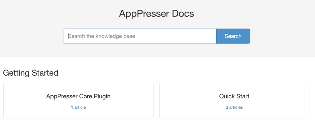
- And finally, on the site’s Docs section
The search bar is like that smiling receptionist in a welcoming lobby asking “How can I help you?”.
Just go on and ask!
The Bottom Line.
Let’s digress from the analogy of ‘navigating’ through a building for a moment to talk about another aspect of human shelter: Prices.

On several occasions, and for various reasons, I’ve found myself in the position of having to find a place to live. Rent or buy, the process will eventually lead to some type of pitch.
This is that moment where a friend, realtor, spouse, or significant other begins to list all the desirable features and amenities of a certain property. The bullet points are rattled off like a pilot performing a pre-flight checklist.
Me? I patiently wait for a break – a breath, maybe – any slight opening to ask the one question that matters…
“How much?”
You see, everyone has a budget in mind. Nevermind how realistic or far-fetched it may be – it is there. Sometimes a sense of cost or budget is only discovered once the price of something is revealed.
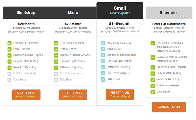
On eCommerce sites, pricing information is usually front & center and not too hard to find. Head over to newly minted WPForms.com and the giant, orange button invites you to ‘get WPForms now’. Pagely.com’s solitary ‘Plans’ menu item on their mobile site leads your eyes and actions to the same conclusion. A pricing table.
When you’re done with the sales pitch and just need to know what it’s going to cost you – well then, a pricing table or page is always right there.
But sometimes a Pricing page itself can be a nice little subdirectory, with filters, tabs or links to take you deeper into the site.
For example, both WPJobManager.com and GiveWP.com‘s add-on pages sport nifty filters to help you get straight to the point.
On AppPresser.com, don’t miss the FAQs and Testimonials tabs to the right of the Pricing table. I’ll cover FAQs in more detail later, but be sure to click on the many links that are peppered throughout the responses. And of course, each Extension listed on the Pricing table is linked to even more information on that particular product.
Like the ubiquitous ‘EXIT’ signs found throughout a building, keep an eye out for those links.
Read on.
Read the Labels
Sticking with the renting/buying analogy for just a little longer. Let’s say I’ve sat through a realtor’s pitch and now have the price safely tucked away in memory. Depending on how closely related the property amenities are to my budget – I may need to take a closer look at those features again.
Or maybe I’m not too concerned with “how much” – as I am about “will it work?”.
Similar to AppPresser, sites like WooThemes.com, EasyDigitalDownloads.com, and GravityForms.com sell extensions or add-ons to extend the functionality or features of a core product. Be sure to explore the links to the specific extensions/add-ons that will fit your requirements.
FAQs:
Anyone who has worked in customer service, behind a security station, or reception area will attest to the fact that there are some questions that seem to get asked by a majority of the general public. It’s usually a list of questions that are asked repeatedly.
So much so that many websites now have an FAQs section – Frequently Asked Questions, for the uninitiated.
Some sites spend more effort than usual to educate visitors on their products. StudioPress.com does a great job of anticipating its users’ questions, offering layers of FAQs.
On the AppPresser website, there are actually a few places to find FAQs on different topics. The first and obvious spot is one I already mentioned above: The FAQs tab on the Pricing page. Next, like most sites, you’ll find a link in the footer menu. And finally in the Docs under ‘Resources’.
But there is one more spot I’d like to highlight, that is dedicated towards one specific type of customer.
Presales
Most of AppPresser’s pre-sales inquiries deal with theme and/or plugin compatibility. That is, compatibility within particular environments.
Because of the nature of AppPresser products, we really don’t have a good tool or system in place that allows customers to demo or test AppPresser before committing to a purchase.
Allowing for a proper AppPresser demo on one’s site would essentially mean giving our product away.
The AppPresser team does a good job of providing examples and creating tutorials on the website, as well as developing apps for download and use like PressChat. Still, this can be a daunting prospect for many customers with smaller budgets and little to no developer support available in-house.
There have been considerations to create a demo site similar to a theme or plugin shop. But ultimately, it would not work well enough, since customer sites vary so widely with different plugins, themes, hosting service, etc.
Until a better solution is in place, our generous refund policy, support team, and well-written documentation is what we have to help out our pre-sales customers. This includes the FAQs section for pre-sales customers located in our Docs.
Speaking of Docs…
The Owner’s Manual

I remember closing escrow on a newly-built condo some time ago. There was the usual forest of paperwork that comes with purchasing a home in California. But this time, a small library of owner’s manuals were part of the archive handed to me.
Because everything was brand new (and under warranty), all the installed appliances and other mechanical units came with it’s own manual to help provide guidance towards installation and maintenance. These included things like the kitchen appliances, garage door opener, gas fireplace, washer/dryer, HVAC, water heater, wood flooring, and so on.
These manuals proved to be useful during the first couple of months after moving in, as I learned how to operate and care for things. And then fix them, soon after the warranty period expired – when things start to break down.
The Docs Section is the definitive owner’s manual for plugin and theme customers.
Here you’ll find the help needed when setting up and customizing your software. AppPresser docs would include information on the app themes, configuring extensions, writing custom code, building your app in PhoneGap, submitting to the app stores, and so much more. In fact, many of my own responses when tackling support issues will include links that refer back to our docs.
From code snippets, hooks, shortcodes, and video clips – it’s all there.
And there for everyone.
Comb through the fine print.
Remember the stack of paperwork I mentioned that came with my condo purchase? That was mostly fine print.
Stuff that most people sign without reading. Or speed scroll down to ‘accept’ and install without a care.
Until something goes awry or turns up unexpected, and then it’s an emotionally charged frantic search for the truth. We’re all Jackie Chiles at that point.
Ok, so maybe I’m exaggerating just a little. AppPresser’s Terms page is hardly a legal masterpiece – but it is worth reading. As hard as it is, do yourself a favor and go through a site’s Terms Of Use/Agreement. Especially the sections on Refunds and Support which go into detail regarding timeframes and scope.
Reach out for help
I learned a lot about effectively navigating in and around the San Francisco labyrinth. Little did I know how much that experience would come in handy for dealing with my next career: airlines and airports.
No matter how intuitive wayfinding was for me, there were (and are) still times that I simply get lost. Or lazy.
This is a point in the journey when it becomes unavoidably necessary to find the nearest representative and reach out for help. On most commercial airlines it’s a button on a panel above your head. Many sites today are using services like HelpScout and ZenDesk who supply an easy-to-spot icon on every page. Press this button for assistance. On AppPresser.com, it’s a blue dot called a ‘beacon’. Go on and click it to send a message.
Not used to seeing blue dots under normal circumstances – or maybe find them a little scary? That’s ok. There’s always the ol ‘Contact’ link up in the header menu. You can usually ask any question from there.
User and support forums are also another great resource to get answers to questions, especially when it comes to troubleshooting and customization not covered by support. While many companies have started moving their official support venues from a moderated forum to docs and helpdesk service, some sites still host forums where the range of participants’ experience range from noob to product core developers.
Put your knowledge to work!
If you made it to the end of this article, congratulations. Hopefully, you found one or two bits of info that could come in handy. If you feel pretty confident that, not only can you find answers to your own questions, but maybe even help a few fellow travelers – then find a home in a forum somewhere – like WordPress.org – to pass along your knowledge.
Or better yet, share something in the comments.
What did I miss? Let me know how you find the help and info you need on a site.


Thanks for retelling Wikipedia!