We are big on apps here at AppPresser, but we also think a lot about the mobile web.
Truth be told, we consider ourselves a mobile company, not just an app company. There are a lot of parallels between the apps we build, and mobile websites. The technology is similar between our apps and mobile websites, and so is the user experience.
We believe apps are an important part of your mobile strategy, but your mobile website is the cornerstone. There are still a lot of misconceptions out there about the mobile web, and responsive design is one of them.
When people talk about mobile, they often ask about responsive design. “Is it responsive? Ok, we are good.” Responsive design is seen as the one and only requirement for mobile, but that couldn’t be further from the truth.
Responsive design is where you start, but it’s not where mobile optimization ends.
Responsive design, as we know it today is toxic to mobile conversion rates. – Joel Harvey
We’ve come a long way since the days of non-responsive sites.
Responsive became a buzz word, and suddenly every WordPress theme and website development shop advertised this as a feature. This is a good thing, because the mobile web has improved quite a bit due to increasing adoption of responsive design.
A responsive design changes your layout so it looks better on a mobile screen. This includes hiding menus in a drop down or side menu, shifting sidebars below the main content, making images 100% width, and making everything single column.

The problem is that most people stop there.
Simply changing the layout of your website for a smaller screen misses 3 important points:
- Mobile users behave differently
- They are looking for different things
- Their intentions are different
Mobile users don’t need to see the same things as desktop users. Simply changing the layout with a responsive design does not help mobile visitors do what they came to do. Speeding up your WordPress site for mobile may be more important than working on the design. You need to give your mobile users what they want quickly, which could involve changing entire sections of your website, not just switching to a single column.
Let’s look at some specific examples.


Many sites use an embedded Google map to show their store locations. Econsultancy found that these maps make it hard to scroll mobile pages.
I have personally seen these maps on mobile websites that are zoomed out and the text and map pins are small and unreadable. It’s frustrating, because you are just trying to get directions quickly while on the go.
What if you replaced this embedded map on mobile with your text address that links to the Google or Apple maps app for directions? That would make it one click for users to be on their way to your store.
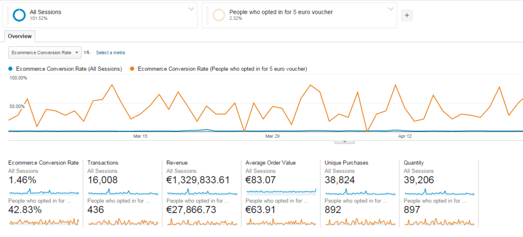
Changing existing content is one idea, adding new content for mobile is another. ConversionXL found that offering a coupon to mobile users resulted in a 43% conversion rate. A mobile-only coupon effectively turned browsers into buyers. If 30-50% of your traffic is mobile, and you boosted your conversions by even a few percentage points, that could have a huge effect on your bottom line.

Mobile users may be the same people who visit your desktop site, so collecting their email to follow up for a sale later on is another great idea. Some people may just be researching or browsing on mobile, but that doesn’t mean you shouldn’t capitalize on that traffic.
Treat Mobile and Desktop Differently
Looking at your analytics data for “all users” can give you the wrong impression about what people are doing on your site.
For example, let’s say you have a 1% conversion rate on mobile, but a 3% conversion rate for desktop. If mobile is 50% of your traffic, your analytics data would show a 2% conversion rate overall, but that is deceiving. What’s really happening is that your mobile traffic is dragging down your overall conversion rate.
Separating mobile users in your Google Analytics data will show you what is really happening. Most sites have a higher bounce rate, and lower conversion rate on mobile. This is partly due to the nature of the platform, but it’s also a signal that you are creating too much friction on mobile.
Talia Wolf from Conversioner & Banana Splash says:
Pay close attention to the mobile visitor’s behavior on Google Analytics, the pages they view, the devices used, their bounce rate, conversion rate, search terms and the funnel they go through (more mobile metrics you can follow). Every detail matters and will allow you to later create a better experience for them.
Whether by changing your copy, creating a dedicated mobile landing page or simply adding a click to call button, any optimization made for the mobile visitor’s mindset can increase conversions dramatically.
Understanding your mobile data separately from other visitors is the first step, the next step is to test separately.
Mobile Testing


Surprisingly, there are a lack of tools that focus on mobile testing. Many are built for desktop only, or for mobile apps. Visual Website Optimizer allows you to a/b test separately for mobile. Running these test separately from the desktop is the first step to really understanding mobile optimization.
Here are some proven mobile optimization tips to help you in your testing.
- For e-commerce, test better product filtering
- Make contact information and location very easy to find
- Everyone hates forms on mobile, simplify them
- Ditch your image carousels
- Get rid of your hamburger menu, make navigation more obvious
- Remove images and ads to increase page speed
- Make sure text is large and readable
- Do anything to speed up page load times
When you are doing these tests, it’s important to remember that different things work on mobile vs. desktop. Important things for mobile include speed, simple navigation, site search, product filtering, and readable text. Video has been shown to be very popular on mobile, and it can even increase conversion rates by up to 200%.
There are no magic bullets, that’s why doing your own testing is so critical.
Is Responsive Bad?
Responsive is not bad.
You’ll often hear responsive design touted as the end all, be all for mobile. This is simply not the case.
Responsive is better than nothing, but don’t think of it as mobile optimization. Your mobile visitors use your site differently, and need to see different things.
Optimizing for conversions starts with understanding your analytics data separately between mobile and desktop. The behavior and intent of a mobile visitor is vastly different than desktop, so why would you lump them together?
Once you understand the data separately, you can then begin to test different content for mobile and start to see your conversions improve. Even if you are not an e-commerce store, you can increase time spent on site, collect more emails, or get more calls.
Responsive design is not the enemy here, it’s the best place to start. Just don’t stop there.