I’m Apple’s favorite type of customer. I’ve owned every version of the iPhone since they launched the original in the summer of 2007. I was late to order the iPhone 7, so I’m still 3-4 weeks away from getting rid of this antiquated 6 Plus.
I can say with 100% certainty that my mobile device usage has grown year over year. Which is no surprise since each new iOS version has more and more features geared toward keeping our eyes glued to the screen. There are 2 features in iOS 10 that I think will have the exact opposite effect and will get you off your phone quicker. And believe me, that’s a good thing!
Widgets
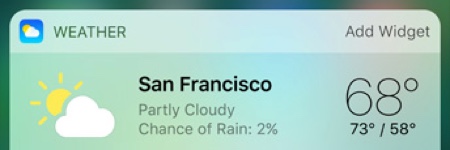
The new Widgets tool was introduced in iOS 10. With it, you can set up a dashboard view of the crucial information you were most likely looking for when you grabbed your phone out of your pocket for the 27th time this hour.
Accessing the dashboard is simple. From your home screen, swipe right. (I told you it was easy) Scroll to the bottom of the list of widgets to click the edit button. From the edit screen, you can add, remove and reorder the widgets to your liking. I’ve set mine up to provide a single screen view of emails I should attend to immediately, upcoming meetings and any reminders I’ve set for the day. Here’s how.
In the Mail app, you’ll now see a “VIP” section listed under your inboxes. You can mark specific contacts as VIP so anytime an email hits your inbox from a VIP, your dashboard will show a numeric indicator over the contact alerting you to an email from them. This is a great way to avoid getting sucked into sifting through your entire inbox while out and about just to see if there are any emails from a business partner, client or spouse.
I use Fantastical as my calendar app of choice because of how easily it lets me track multiple Google calendars. And with the dashboard widget, I can see my next scheduled event at a glance no matter which calendar it’s in. The default calendar app works similarly and there’s a dashboard widget called “Up Next.”
The reminders widget is, again, a super quick way to view any reminders you’ve set for yourself. I particularly like the reminders tool for how easily it is to add items via Siri. “Hey Siri, Remind me tomorrow at 11am to call Steve.” It doesn’t get much easier than that. And with the dashboard widget, seeing what reminders are coming up is just as easy.
My last visible widget is Evernote which provides a one-click link to the last document I edited. I found this super handy at a recent conference where I was taking notes throughout the day. Hoping in and out of the document to add more notes was easier than ever.
Since the release of iOS 10, I’ve seen a great number of my installed apps getting updated to provide a widget view. Some are extremely useful, and others, not so much. But I find myself returning back to the widget edit screen every few days to see what new time-saving widgets have shown up. I suspect we’ll be seeing a lot of productivity apps bringing their best features to the widget screen soon.
3D Touch
For the uninitiated, 3D Touch is a feature that, when you press down firmly on an app’s icon, it brings up a menu of actions you can initiate or specific locations inside the app that you can access in a single click. From a time-saving standpoint, this is huge.
One of the most common examples I like to give has to do with adding events to the calendar. In the past, you’d need to click the icon to load the app, locate the Add Event icon (which could be buried on a second screen), click the icon and then start adding your event. Where now it’s as easy as a firm push and a click on the New Event menu item and you’re instantly taken to the appropriate screen.
Evernote’s 3D touch menu gives instant access to adding new notes, taking a photo or searching your documents. Chrome’s provides direct access to new tabs, new incognito tabs and voice search. Twitter’s includes search, new tweet or direct message. Even built in apps like the camera, calendar, timer and flashlight have 3D touch menus all designed to help you get to the exact spot in the app you want to go with fewer clicks and page loads.
Our mobile devices should be making our lives easier. But that doesn’t mean they need to require our attention all day every day. They should work for us when we need them and get out of the way when we don’t. One great way of doing that is by getting us the information we need as quickly as possible or to let us perform the actions we need in as few steps as possible. The new Widgets and 3D touch features feel like a step in the right direction.
Are there other features in iOS 10 that have sped up your workflow? Tell me about it in the comments below. I’d love to hear about it!
