When designing websites for mobile devices, the devil is in the details.
Many websites have a low conversion rate on mobile, and it’s usually because filling out forms is such a pain. It’s easier to fill out forms using a desktop keyboard, so most people don’t even bother on mobile.
Making forms easier to fill out can increase mobile conversion rates, and adding steppers in place of number select menus are a great place to start.
Luke Wroblewski notes in his article on the subject, “Dropdowns should be the UI of last resort.” Why? Because they are a 4 click operation on mobile, compared to 1 click for a stepper.
For example, let’s look at the WooCommerce cart page on mobile, using the Storefront theme.
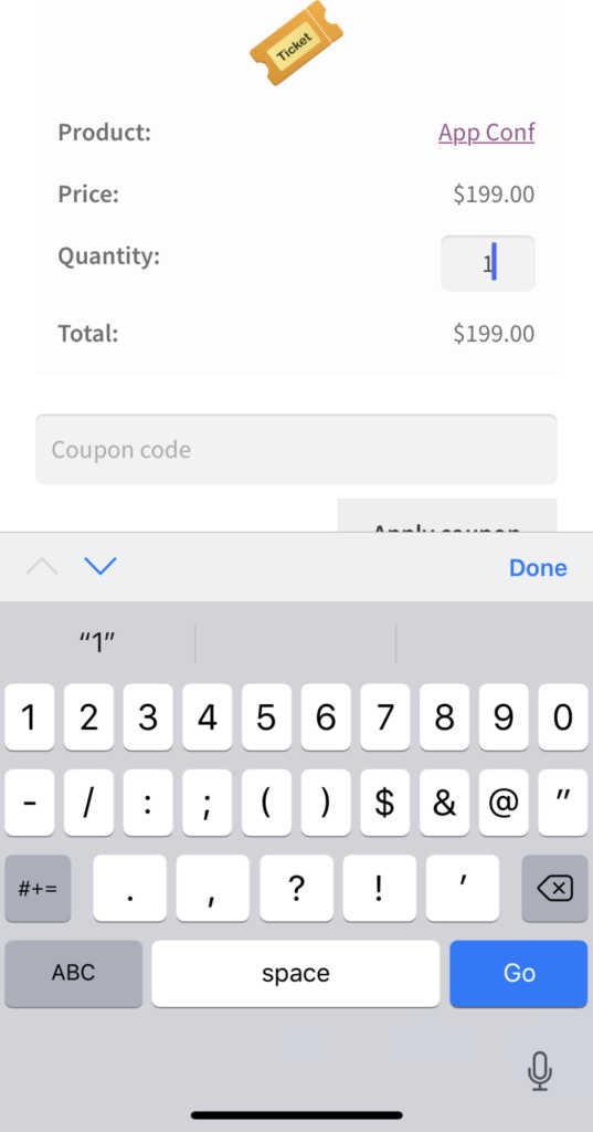
Quantity Text Input

To change the quantity of an item in the cart, we have to click in the input, delete the existing number, type a new number, then press done.
That’s 4 steps.
Quantity Select Menu
If this was a select instead of an input, it looks cleaner on mobile, but it’s still too many steps.
Click the input, scroll to a number (possibly a few swipes), and press done.
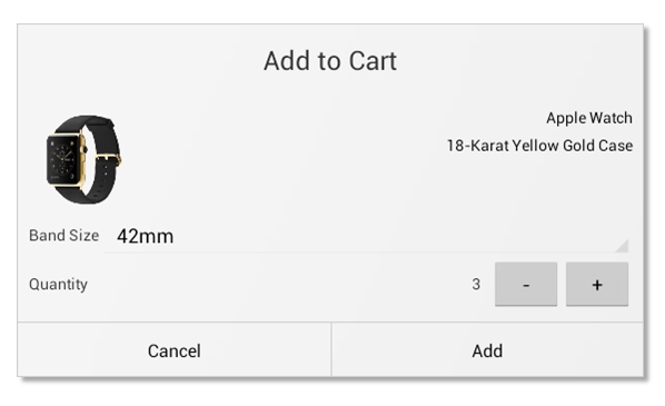
Quantity Stepper
Now let’s look at a stepper for the same quantity input. It’s one click to increase or decrease the quantity.
For some shops that small change could boost revenue instantly.
How to Use Steppers
There is no HTML element for a stepper like this, but you can use a bit of Javascript to increase and decrease the input value when a button is clicked.
This library is fairly lightweight and includes implementation instructions. For WooCommerce specifically, this may get tricky with AJAX update cart refreshes. You may want to look at this solution.
When To Use Steppers
Dropdowns are not always bad, but when a user just needs to quickly change a value, a stepper is a much better option. The example Luke W uses in his article is adding more travelers to a flight booking:
Steppers are a great solution for number inputs that do not need a large range of values.
Steppers may seem like a lot of work to make one input easier to use on mobile, but if you also add radio groups and other controls like you see in the image above, it makes a big difference.
Apps like Kayak, Zillow, and Amazon have set a high bar for speed and ease of use. Mobile users have no tolerance for slow, clunky web forms. They will decide to “do it later” on desktop, which hurts your conversion rates. Steppers are one way to make forms easier to fill out on mobile.
